Definition of Ambigram

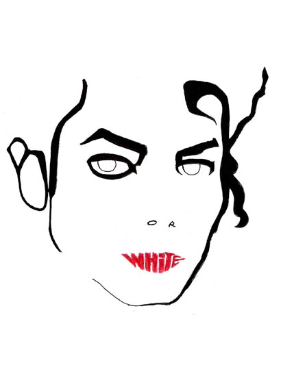
Some people said that my late productions on the matter of ambigrams (like Why So Serious? and Nirvana) may be misclassified, for they may not really be called “ambigrams”. I believe my classification is correct. I’ll argue it, but I’ll also bring up some questions and expose the great problems of trying to define what an ambigram is indeed. I’m writing this post in portuguese and english because I’d like to hear the opinion of other ambigramists, and most of those I’ve seen were foreigner and english speakers (although not always as native language), like Nagfa, maybe even John Langdon(for those who don’t know, he’s who made the ambigrams for the book/movie Angels and Demons).

Let’s begin with the literal meaning of the word. Ambi- means “both”, “two at the same time” (see words like ambidextrous, ambiguity…), and -gram means “reading”, “letter”, “written text”, “register” (see words like grammar, anagram, electroencephalogram…), so the word means “two readings at the same time”. To some people therefore it seems obvious that ambigrams only involve letters and/or words, because those people associate “reading” with things written in verbal language, but the fact is that you can “read” non-verbal things. Everything which have a language (visual language, sound language, body language…) can be read, interpreted.

That’s the problem. My sister even joked saying that I call everything “ambigram”… She said that if I saw a transvestite I would say it is an ambigram, that if I saw an ornithorhyncus I would say just the same =D… It’s truly complicated. Can’t Arcimboldo‘s paintings be called ambigrams? And Rubin Vase and some Salvador Dalí paintings? This is the moment someone gets up from his chair and says “Wait, these have a name already! They’re optical illusions!”. Bingo. They’re optical illusions indeed, but the fact is that the concept of ambigram, under my perspective, goes far beyond this of optical illusion. Musics that say different things when played backwards, for instance, would be ambigrams. However, a food that has cold stuff and hot stuff, or sweet stuff and salted stuff, wouldn’t be an ambigram, once ambigram is a single thing that has “two readings at the same time“, even if those readings are not perceptible at the same time.

I think it’s time to enunciate the definition I purpose. Ambigram is every element that, without having it’s content altered, can be knowingly perceived in two or more different forms by at least one of the human senses. That would include from optical illusions to musics which make sense when played backwards, besides some other things that humans have not invented yet =P. I’d like to know what you do think about this definition

Why So Serious?

I know everybody is sick of hearing, seeing and speaking about the latest joker, played by Heath Ledger, but this idea was wandering in my mind since some time, and today I started sketching it to see if it would work out well. It did.

Why so Serious?

Cool, huh =P? My first and only contacts with this kind of…. ambigram, I guess I can call it so, were in an advertising campaign of Veja, a brazilian magazine, under the slogan “Get both sides“, designed by the AlmapBDDO agency.

"Get both sides" Campaign

I think I’ll make some other illustrations like this soon  :).

666 – Devil

This ambigram deserves its own post. It’s not that I like its meaning (I’m not even completely atheist – I’m agnostic – let alone satanic), but its simplicity, originality and perfection are noteworthy. It almost seems I’ve made a pact with the devil to create such and ideal ambigram xP.

It’s on the same level, maybe even higher, than the Amor/Love ambigram, although they are of different kinds. That was a perceptual shift (or oscillation) ambigram (the two possible readings depend on the perception of the letters, no need to rotate or something) and this is a reflection one (the alternative reading is seen using a mirror, or horizontally inverting the image with a software). Below is my handmade version:

666/devil

Reflecting…

devil-666

This ambigram certainly is one of mine which would look cooler as a tatoo, or as an element of a horror story, maybe the mark of a serial killer…

Anatomy of a Rabbit

Anatomy of a Rabbit - mixed media

This “rabbit” is like the one from Alice in Wonderland, always in a hurry, selfish, materialist, concerned about work, about time, representing the modern man… There is, however, some interesting differences (which somehow emphasize Alice‘s rabbit original meaning), and that’s when the materials talk…

Anatomy of a Rabbit (detail)

P.S.: This work was the winner of the Painting category of the I Festival de Arte da UFPE (Federal University of Pernambuco First Art Festival), on may 2010.

Jan Švankmajer’s Portrait

I’ve talked about czech artist, animator and director Jan Švankmajer around here. This one painting didn’t have to be his portrait, since its most interesting trait (the change of appearance if seen through blue translucent material) doesn’t depend on that, but I decided to pay him a tribute. Besides, this work’s “message” ends up having something to do with his art.

Truth is I end up indirectly “paying a tribute”  to several friends with this drawing. Fabiana Peixoto, for showing me some stereoscopic images not so long ago, which certainly incubated in my mind ideas like the one of this painting. Clara Percílio, for introducing me to Jan Švankmajer’s work and, mainly, for making me have the first contact with the maxim “The distance between insanity and genius is measured only by success, which somewhat is this work’s message and, at last, my great friend Arthur Soares, and his blog A Insanidade, whose name I ended up seeing while thinking of what to write on the drawing (my original idea was to write something in czech, maybe Šílení but looking at the blog gave me the  insanidade/sanidade – insanity/sanity – idea). Here is the piece:

Jan Švankmajer's Portrait - colored pencil on paper

Here I tried to simulate how the work looks like when seen through blue translucent material, like acetate, celophane paper etc. Depending on the material, it may be necessary to see through two layers to obtain the desired effect.

Jan Švankmajer's Portrait - alternate look

P.S.: There are several ways of exhibiting this piece: changing ambient light color, making a “curtain” of blue cellophane, even using regular 3D glasses and closing eyes alternately is interesting. In the only exhibition it was showed so far, glasses made with paperboard and cellophane paper were used, designed in a way it can be inferred they represent “success”.

Blog de Victor Maristane